Since UNC Libraries redesigned its website in the summer of 2013, the User Experience department has run routine research and design campaigns to assess our product and made regular updates to better meet patron needs.
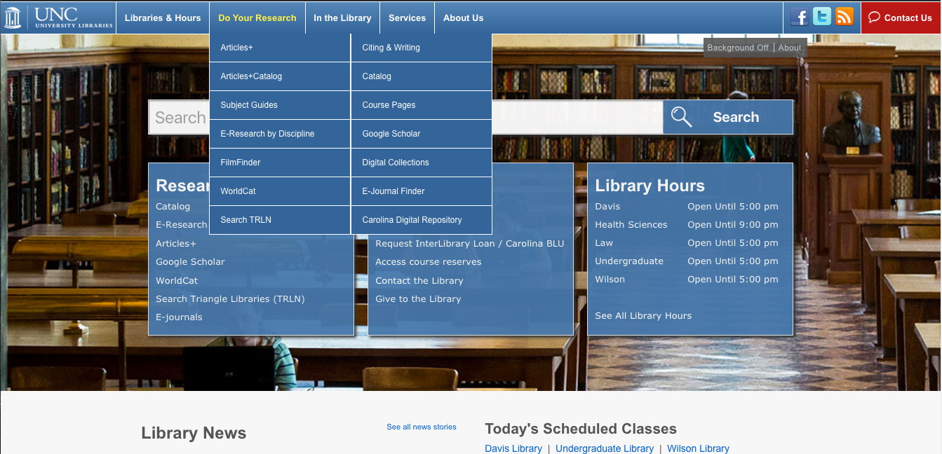
It’s been clear for some time that the navigation and organization of content on library.unc.edu is not completely understandable to our users. In user surveys and interviews the labels on our website navigation are often brought up as being unclear or too similar to each other, especially “In the Library” and “Services.” We even observed several library staff members who failed to understand the distinction.
In Fall 2015 we ran a number of research initiatives to formally assess the navigation, and, ideally, update our labels as well as our overall information architecture to better reflect the mental models of our patrons.
We also decided to address our relatively barren footer with this project. The footer on library.unc.edu did not provide some of the critical information usually found in a website footer (e.g. About Us links, contact information, etc.) and did not reflect our primary header navigation like many footers do.
Internal goals
- Run several research initiatives to gather robust analysis of current navigation problems
- Respond to these results with an updated information architecture plan with new labels
- Reflect the new navigation in a more conventional footer on library.unc.edu
Research conducted
To reach these goals, we began research initiatives to address the content within our navigation and the tasks of users coming to our site as well as to assess the current organization of content.
Our research initiatives
- Collecting pageviews and unique pageviews for pages found in our universal navigation
- Surveying library staff about content organization and site navigation
- Reviewing navigation labels from other large academic library websites
- Analysis of previous user survey responses to “Why did you come to library.unc.edu today?” to understand important tasks
- Miniature content audit of pages found in our universal navigation to address redundant/obsolete information
- Preliminary open card sorting with patrons in Davis Library (using OptimalSort from Optimal Workshop on an iPad)
- Tree testing of old navigation (using Treejack from Optimal Workshop)
- Remote open card sorting with library.unc.edu users (using OptimalSort from Optimal Workshop)
Research conclusions
From this semester-long spout of research, we came to several conclusions about the navigation of library.unc.edu:
- 75% of users of library.unc.edu come to site to find research materials, e.g. books, journal articles, etc. The remaining 25% visit to see hours, renew items, find study space, etc.
- The top pages librarians point patrons to at service points include hours, places to study, and booking a study room
- While tree testing results saw moderate success rates, directness rates showed that participants back-tracked significantly on certain tasks. This suggests that there is some ambiguity to the organization of content
- Card sorting results divided content into 3 conceptual categories: research, physical library space, and support
Updated information architecture
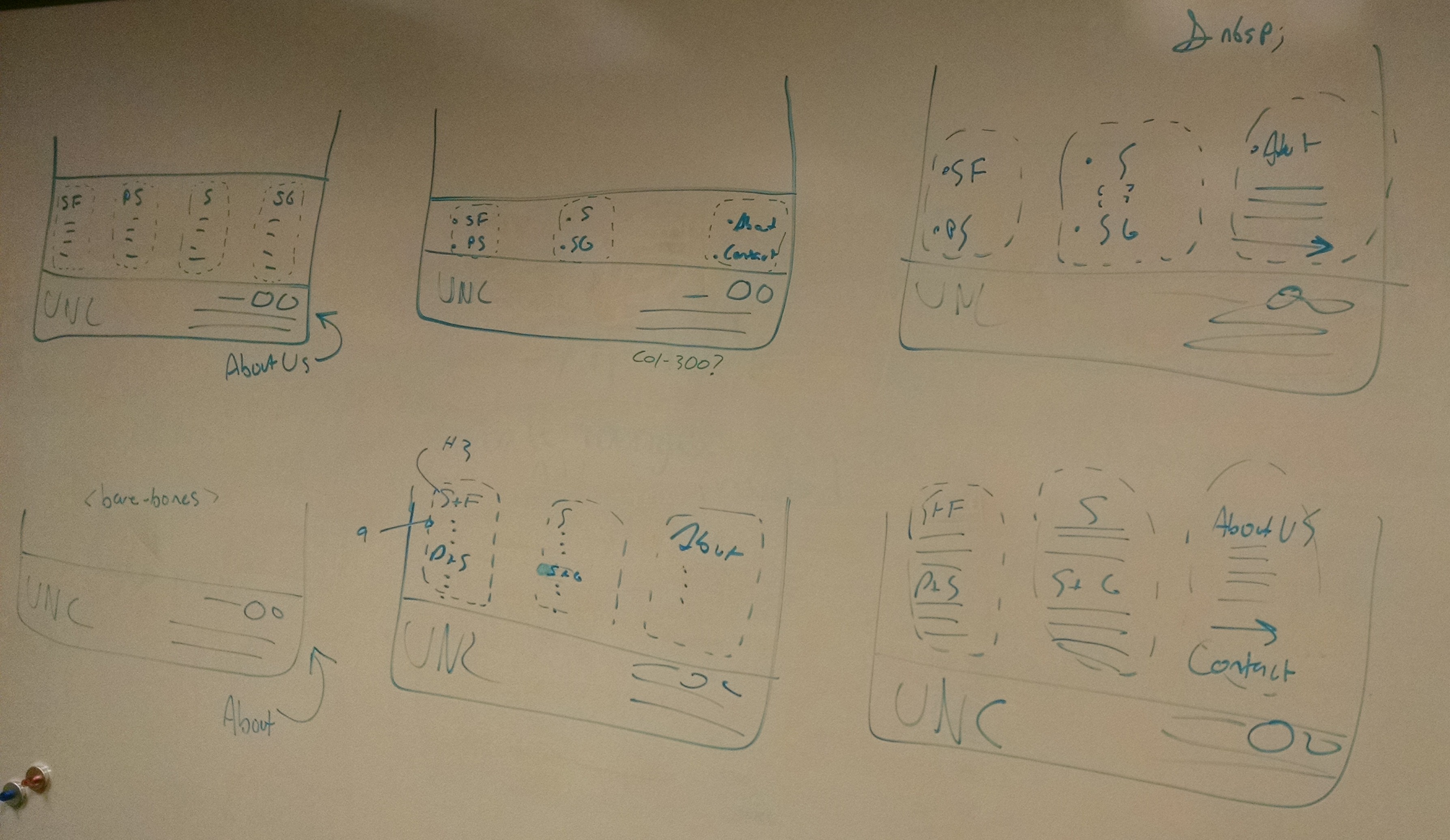
Most important to updating the navigation of the site was creating a new conceptual way of separating content. Card sorting showed that as a group participants sorted content into one of three categories: Research, physical library space, and support. Within each of these categories we were able to break things down with two sub-categories for each.
After deciding that the two subcategories under “physical library space” were distinct enough to be their own categories (and agreeing that “physical library space” was far too cerebral as a website category), we developed a new information architecture for navigation content.
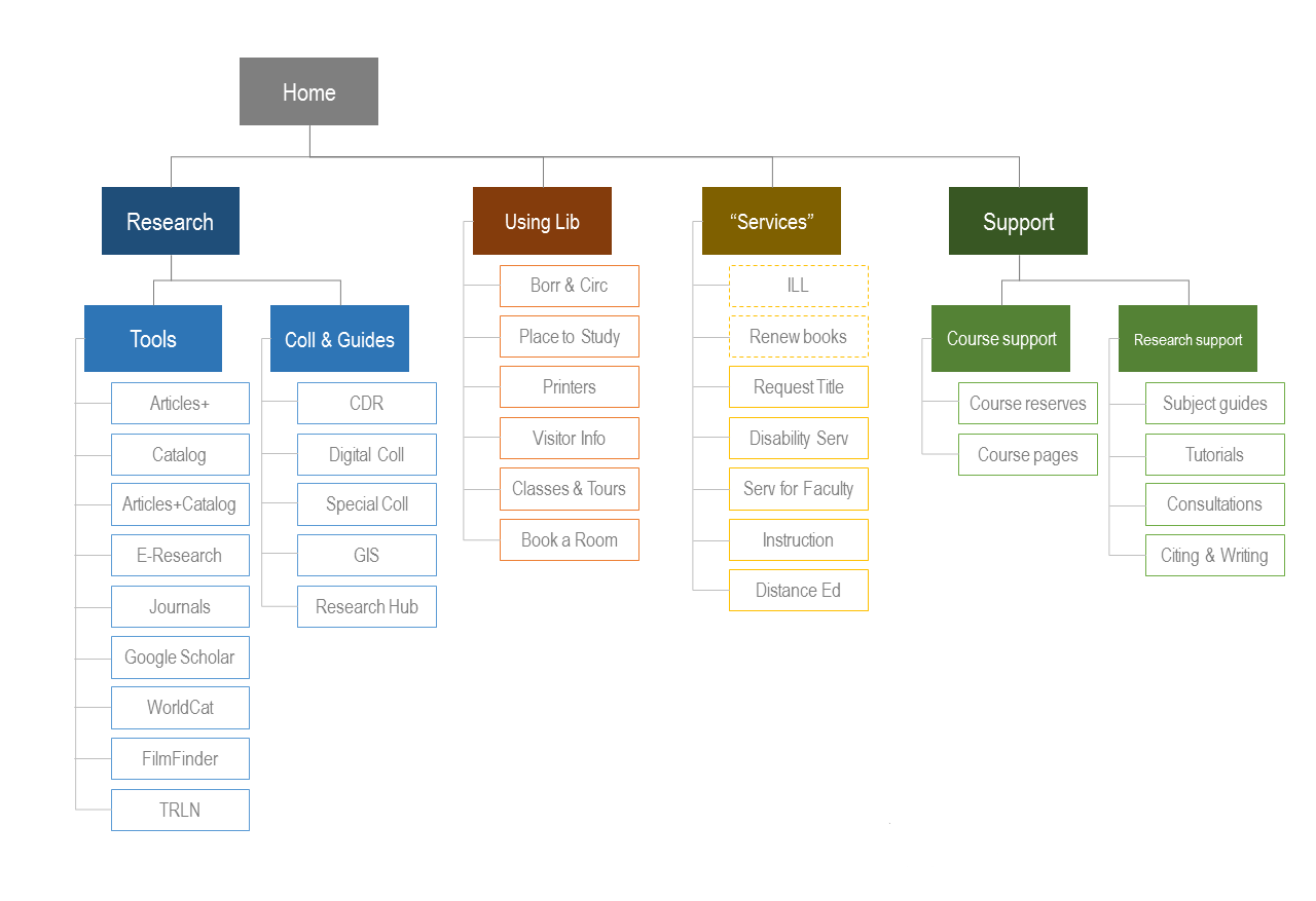
The above figure is a broad, conceptual-level breakdown of organization for the navigation. A new category has been added to the navigation, Support & Guides, to point users to content such as course reserves, tutorials, research consultations, etc. The other three categories more or less reflect the old navigation, both with updated labels to better illustrate their purpose.
New navigation
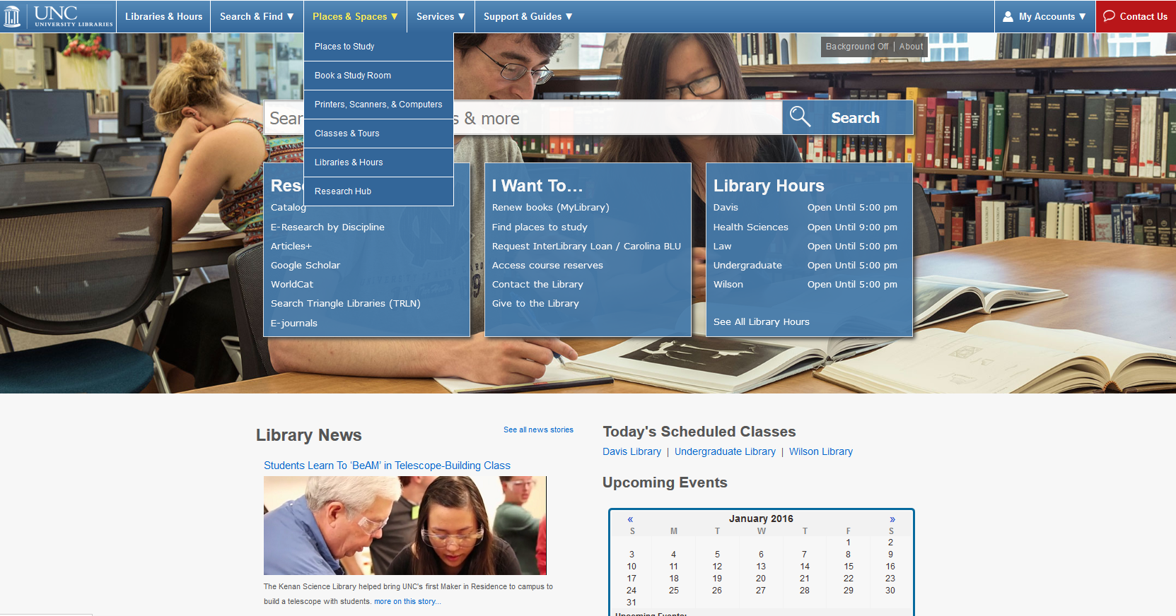
From this, we’ve changed our site’s universal navigation to something we hope will feel better organized and properly labeled to our users. Through shifting of content we also were able to dramatically decrease the amount of options found within the navigation, as one of the major conclusions of our in-person usability testing last winter was that users are given too many options and might experience overload using the site.
We also added a My Accounts option to the navigation as per frequent user requests.
Relocating About Us links
One of the major changes we made was moving the About Us links from the header to the footer. While some of the About Us pages are used often, their traffic overwhelmingly comes from Google and not from our dropdown navigation.
Our testing also found that because the links were hidden behind a dropdown, users often didn’t know what they expected to find there. By moving them to the footer and outside of a dropdown, we both make the links more visible across every page of our site and free up header space in a high-demand area of our navigation.
Future plans
We plan on doing follow-up testing during the Spring 2015 semester to double-check the effectiveness of this new navigation structure. Our hope is that students, staff, faculty, and other library users will all find it easier to get where they’re going.
One major outcome of this project is that our menu and footer structures are now better situated for iterative development. We should be able to make smaller more regular changes going forward instead of large overhauls.
Update: We conducted a follow-up study to investigate now effective our changes to the navigation were.
Contributions
This project was completed by:
Daniel Pshock, User Experience CALA
Chad Haefele, Interim Head of User Experience
Sarah Arnold, Instructional Technology Librarian
With development by:
Steve Segedy, Applications Analyst