Building a navigation structure for librarians is some of the most intimidating work I’ve ever done.

The new UNC Libraries staff Intranet will roll out this summer. We’re calling it LOUIS, named after Louis Round Wilson – early 20th century UNC librarian and namesake of Wilson Library. And because we’re librarians, that’s an acronym: Library Of Useful & Interesting Stuff.
We’re moving from an intranet powered by an ancient combination of Joomla and Mediawiki into Sharepoint. But this post isn’t about the platform. Instead, I’m outlining and reporting on our process for developing the top navigation.
Our Plan
Because we know the names and email addresses of every single potential user of LOUIS, I had a unique opportunity to survey and talk to an entire user population. My regular work can rarely be scoped so cleanly, and it made for a nice change of pace.
Working with our Intranet Steering Committee, we came up with a 3 phase approach:
- A broad, open-ended survey.
- Develop and test a first draft of the navigation.
- Revise the navigation based on the test results, then retest and do final adjustments.
Phase 1: A broad, open-ended survey
In February we built a simple anonymous survey in Qualtrics, and send it out to all library staff:
- Which current library intranet do you use most often?
- Our Health Sciences Library staff currently use an intranet separate from the rest of our staff, so this question helped establish a basic demographic idea of who was responding.
- What are the top 5 things you look for on the library intranet(s) (whether or not you find them successfully)?
- What one type of content do you most wish were on the library intranet(s)?
- Are there tools or content on the library intrnaet(s) that you use, but wish were easier to get to?
- Is there anything else you’d like to tell us about how you use the library intranet(s)?
Phase 1 Results
We had 90 responses, which gave us plenty of data to work with. For privacy concerns, I won’t publish the entire report here. But these are highlights, from after we coded and standardized the terminology:
| Response | Count |
|---|---|
| IT Support | 62 |
| Procedures & other wiki use | 46 |
| Staff Directory / Photos | 37 |
| Travel info / Travel forms | 28 |
| Other* | 21 |
| Tech Services docmentation & forms | 20 |
| Security Blog | 20 |
| Library Line | 18 |
| All-Staff & other meeting reports | 15 |
| Committee info | 14 |
| Room & other booking systems | 12 |
| Schedule Me | 12 |
| Retirement / Featured stories | 11 |
I do want to point out my personal favorite response to question 2: “access staff wiki (which I hate – that wiki must die)”
And my favorite response to question 5: “Put photos of everyone in the photo directory, or abandon the project. Half ass sucks.”
Overall, responses to questions 3-5 expressed frustration with the old intranet and a sense of excitement and openness toward a better option.
Phase 2 & 3: Develop, Test, Revise, Test
Based on the results from phase 1, we built an early draft of our navigation. At this point our top-level categories were Library Docs, Policies & Procedures, Human Resources, IT Services, Quick Links, and My Sites.
I didn’t expect this design to be perfect, in fact I could identify issues right from the start. But I find it helpful to give users something, no matter how rough, to react to. Those responses are always more helpful than asking them to work with a blank slate.
We entered this draft into Optimal Workshop’s Treejack tool (the same tool we used in another recent project), and asked staff to accomplish a series of 8 tasks. For example:
- You need help troubleshooting an issue with your work computer. Show where you would go to get help.
- Show where you would go to see the latest meeting notes from a committee you serve on.
- You urgently need to sign up for the annual staff BBQ. Show where you’d go to get your name on the list.
The full list of tasks is in our report.
Phase 2 & 3 Results
We sent the Treejack test to all library staff. Treejack let us see the paths they took, plus whether or not they were successful in each task. My recommendations after this round of testing included:
- Change “Policies & Procedures” to “Policies”
- Move the photo & staff directories to Human Resources
- What is Library Docs? Rename it, label is too generic.
- Staff training for the Intranet needs to emphasize tasks related to accessing departmental and committee workspaces.
- Eliminate Quick Links.
I’d previously wanted to eliminate Quick Links as a category, but couldn’t figure out how else to organize the assorted links it contained. These test results gave me the information and options I needed to do a better job.
As one respondent to the test noted: “Quick Links seems to be a miscellaneous catch-all. You can do better than that.” He or she was right. Breaking up Quick Links led to major improvements in the navigation.
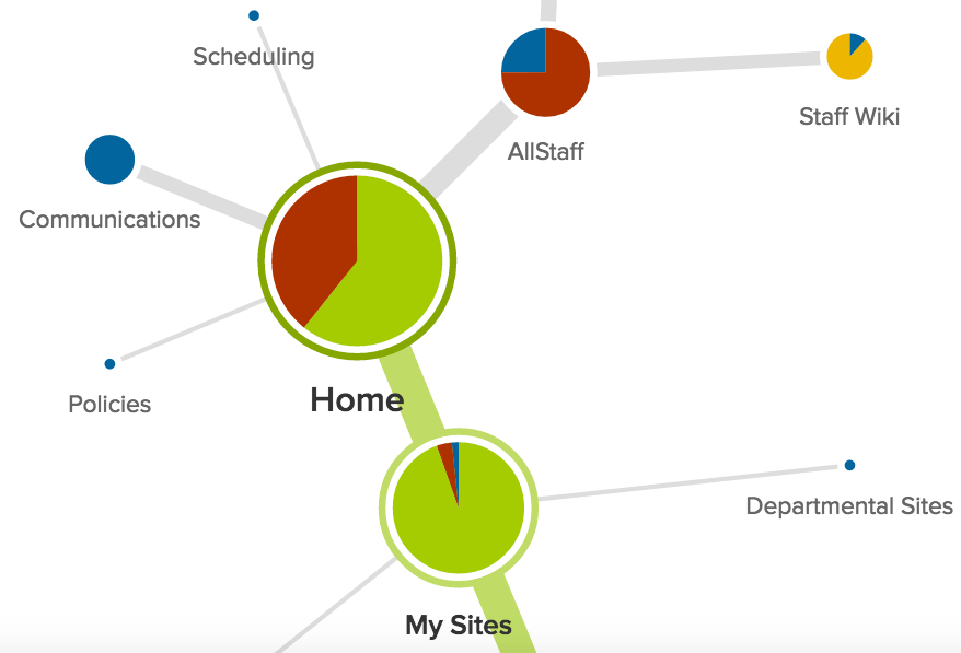
After revision, our top-level categories became:
- AllStaff
- My Sites
- Policies
- Human Resources
- Communications
- IT Services
- Scheduling
I’m personally much happier with this arrangement, and it tested better too!
We distributed another round of Treejack-based testing to staff to check whether our revisions were on the right track. We added two additional tasks, but kept the other eight task descriptions identical to the previous test.
Results showed that our staff were able to get to the right pages faster (in some cases twice as fast!) and with fewer errors than in the previous navigation structure.
Some of this improvement could be attributed to a training effect, since staff had seen the tasks before and portions of the navigation stayed the same between tests. But even if that’s the case, it still proves that staff can learn our layout.
Since we have the rare opportunity to do training with every single user of this system, we can address any remaining shortcomings that way.
This task had our most notable improvement:
You need to reference procedures for a common task in your department. Show where you would go to look them up.| Round 1 | Round 2 |
|---|---|
| 60% success | 94% success |
| 41% direct | 75% direct |
| 15.24 seconds | 7.89 seconds |
| Rating: 4 | Rating: 9 |
Conclusion
It was incredibly gratifying to see this improvement, and to see the process of iterative testing & design perform as intended. Our full report on test results from Phase 2 & 3, including each task’s results, is below. I look forward to introducing library staff to LOUIS and our improved navigation in the coming weeks, and am extremely thankful to all our staff for their time and critical thought as we tested.
Full report
Contributions
This project was completed by:
Chad Haefele, Interim Head of User Experience
With assistance from the LOUIS steering committee:
Emily Brassell, Applications Analyst
A.J. Dean, Manager of Desktop Support
Lynn Eades, Web Development Librarian
Judy Panitch, Director of Library Communications