The UNC Libraries provide access to an overwhelming number and variety of resources. These can be anything from hefty books to databases holding decades of newspaper archives. With all this variety, it’s no wonder that students find research to be a daunting proposition. This is where the subject guides come in.
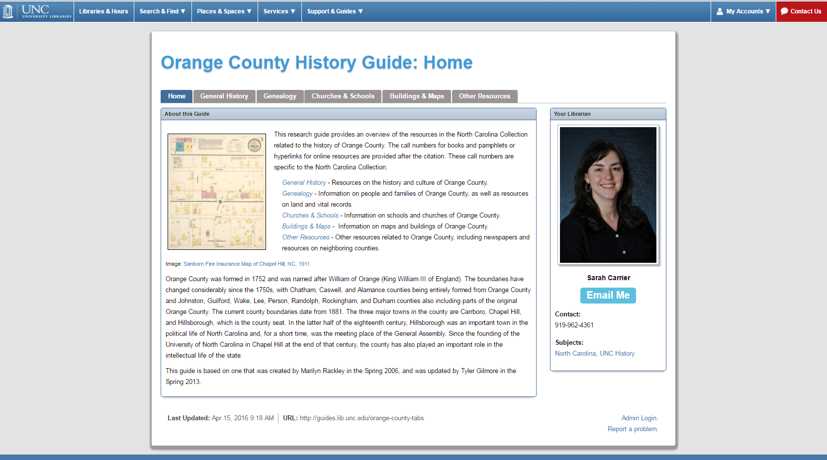
Subject guides are websites created by librarians to help point students toward resources. They are hosted on the third-party LibGuides platform, so all subject guides have a unified look and feel while allowing librarians room to create whatever content they want. Each subject guide is tightly focused around a specific topic, such as the History of Orange County, and gathers research resources related to that topic. Subject guides serve as a filter, making UNC Libraries’ overwhelming array of resources a little bit more accessible to the inexperienced researcher. Unfortunately, subject guides are extremely underutilized.
In Fall 2015, we decided to take a closer look at our subject guides, in order to understand why they were being underutilized. We hoped that conducting a usability test would give us some insight into how people viewed subject guides and what issues they might encounter while using them. We hoped that improving the guides’ usability, appeal, and usefulness would make them an even better resource for students and faculty alike.
Preparation & General Survey
We spent the Fall 2015 semester conducting our own research. We hoped to gain a better understanding of the usability issues that were of most interest to us. We also used that semester to prepare for the study itself, planning the format, preparing our tools, and seeking IRB approval. When the Spring 2016 semester rolled around, we were ready to begin.
The first part of our study was a general survey, sent in January 2016 when the spring semester was just beginning. The survey was hosted in Qualtrics, a versatile online survey software, and sent out through the campus-wide listserv. In the survey we asked respondents questions about what they thought subject guides were and how they used them. However, Qualtrics allowed us to do more than just ask questions.
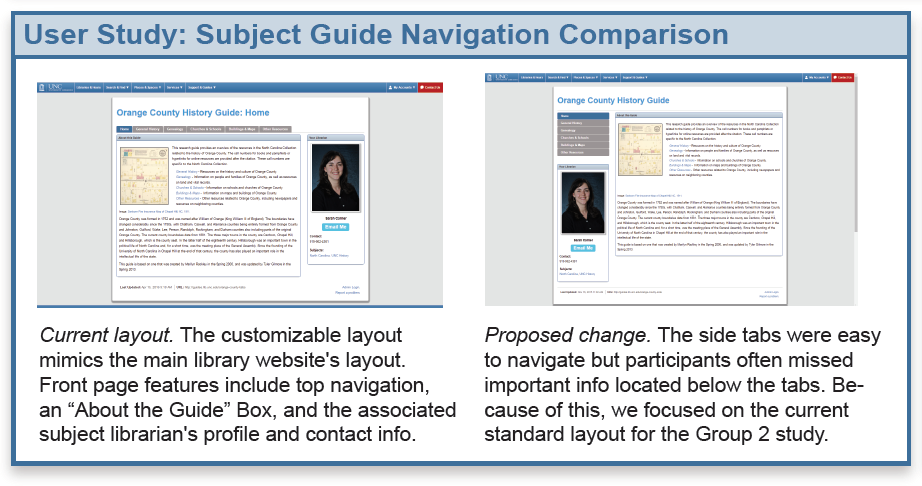
One of the things we were most concerned about was the overall layout of the subject guide. The current default layout has navigational tabs along the top of the page. Our preliminary research suggested that there was a strong case for moving the tabs from the top to the sidebar down the left side of the page. Furthermore, the current default style of the subject guide requires having a list of links to each section on the home page, with a short description of each section. We were worried that these links were taking up valuable screen space while being unused.
Survey Results
In our initial survey, we took advantage of Qualtrics’ powerful survey tools to get heat map data. We displayed a screenshot of a web page with a navigational question (“Based on this page, where would you go to find more information about Buildings and Maps in Orange County?”). Participants clicked on the image where they would go to start research on that question. Qualtrics recorded each click, and the aggregate data would show us what kind of navigational tools people preferred.
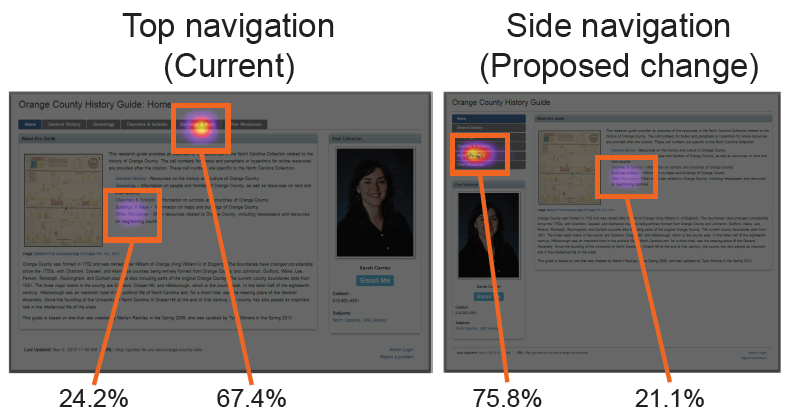
To our surprise, we found that at least 20% of our respondents used the links list rather than the navigation tabs. This was true regardless of whether the tabs were at the top or on the side. This suggested two things to us. First, the links that we had thought were useless were in fact being used quite a bit. Second, the navigation layout didn’t seem to have much effect on how people navigated the page.
Of course, our survey wasn’t all smooth sailing. When we decided to use the campus-wide listserv for our survey, we hadn’t realized that the listserv was opt-in rather than opt-out. As a result, we were unfortunately not able to reach many undergraduate students, despite them being our primary population of interest.
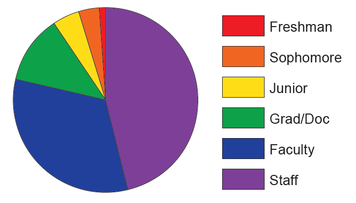
This respondent distribution had a big effect on phase two of our study, which consisted of user studies using the think-aloud protocol. We had hoped to conduct three rounds of testing, each one consisting of five participants. However, the small number of student respondents forced us to cut one round of testing. As a result, the first group of participants consisted of undergraduate students. The second round was a mixture of graduate students and faculty.
“Think-Aloud” and Usability Testing
Each round of tests in the second part of our study followed the same format. We asked each participant to perform certain tasks using a subject guide we had set up specifically for the testing. We asked each participant to “think aloud” as they carried out the tasks, talking us through their thought process and reactions. In addition to these tasks, we also tried to get more insight into participants’ thoughts and reactions by engaging them in conversation.
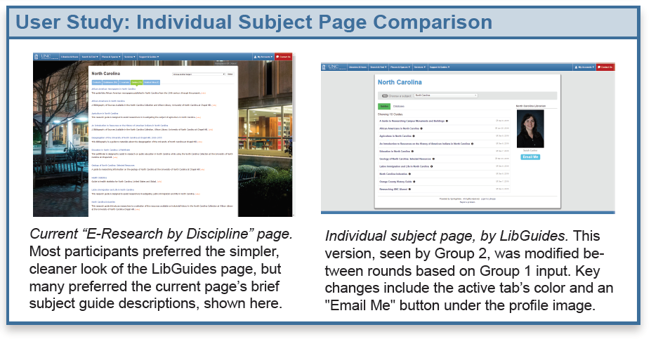
Throughout both rounds of testing, we specifically looked at two pairs of pages: the subject guide itself, and what is currently called the “E-Research by Discipline”, a landing page that gathers resources related to a specific topic and which may include, among other resources, links to multiple subject guides.
Results & Steps for the Future
After the final analysis of our results, we came to the following conclusions. As we expected, people had a lot of trouble finding the subject guides through the website. There seemed to be a good number of participants who recognized the subject guides once they were described or displayed to them, but who did not understand what the term “subject guide” meant until they saw a clear example of them.
Once participants got their hands on the actual subject guides, we found that most participants had little trouble navigating the guides. Also, most participants expressed a preference for the current subject guide layout with horizontal navigation tabs. However, most participants preferred the LibGuides-generated Individual Subject Page to our current “E-Research by Discipline” page, though not without reservations. Among these reservations were the fact that the Individual subject page lacks descriptive information about the subject guides, which is present on the E-Research by Discipline page.
Several improvements were planned for the subject guides as a result of this study. Some were small cosmetic changes to improve overall usability, like increased font size, adjustments to link colors for visibility, and improving the visibility and usability of the librarian contact information displayed on the LibGuides’ individual subject page. All the E-Research by Discipline pages will be updated to the individual subject page as well.
Of course, our research into the subject guides is far from over. Further research will include investigation into ways to improve the subject guides’ “discoverability” so it’s easier for patrons to access and use the guides. We also plan to conduct more research into best practices for naming navigational features like the tabs in each subject guide. We hope to improve the subject guide style guide by providing librarians with guidelines for how to create the easiest-to-use subject guides possible. Also, once we’ve finalized all the subject guide updates from this study, we hope to carry out another round of user testing this fall.
Contributions
This project was completed by:
Stephanie Hsieh, Stone Center CALA
Sarah Arnold, Instructional Technology Librarian
With assistance from:
Daniel Pshock, User Experience CALA