Introduction
Headings are a common sight on web pages. They organize the content and break it up for easy reading. But why do we need headings? How do we use them for best effect?
In this post, we’ll cover:
- What are headings
- How the UNC Library uses headings
- What we’re doing to improve heading use
What are headings for?
Visually, headings might not seem like much. For people who rely on WordPress’ Visual Editor to help them style their web pages for best look and effect, the heading options might seem like a just a simple way of quickly making text look more or less important. But the truth is, headings are more than just visual flourish—they’re part of a web page’s skeleton, and add meaning and organization to what would otherwise be endless, undifferentiated paragraphs. Behind the scenes, HTML uses tags like <article>, <h1>, and <p> to define parts of a web page in a meaningful way. Heading styling and place help a casual viewer understand how a web page is organized.
For website visitors and library patrons who rely on screen readers and similar assistive technology, headings have a more important purpose. Such technology uses the HTML to understand the web page and convey its meaning to its users. HTML tells these devices things like:
- What information is important?
- How is the information organized?
- Where is the important information?
Here’s a quick demonstration of this principle in practice. This video is a short demo of NVDA, a popular open-source Windows-only screen reader. (The demo uses an add-on to visually highlight the elements with colored boxes.) Using a keyboard, a user navigates between parts of the web page while NVDA describes each part as its selected. In its descriptions, NVDA includes contextual info like whether or not a link leads to a page that’s already been viewed. Note how NVDA specifically mentions heading levels, helping users understand the relative importance of the section that’s currently highlighted.
Tips for Using Headings
It’s important to keep two things in mind when using headings:
- They organize the page, and
- They are hierarchical.
We’ve covered the organizational uses of headings in the previous section, so in this one, we’ll focus on the second property. Headings come in six flavors, indicated in HTML with <h1> through <h6>. Usually, the higher the number, the less important that heading is. Accordingly, higher number headings tend to be smaller and less prominent. It’s important to make sure that headings are nested so that the hierarchy of importance is always clear.
Let’s look at a page from the library website to see this in action.
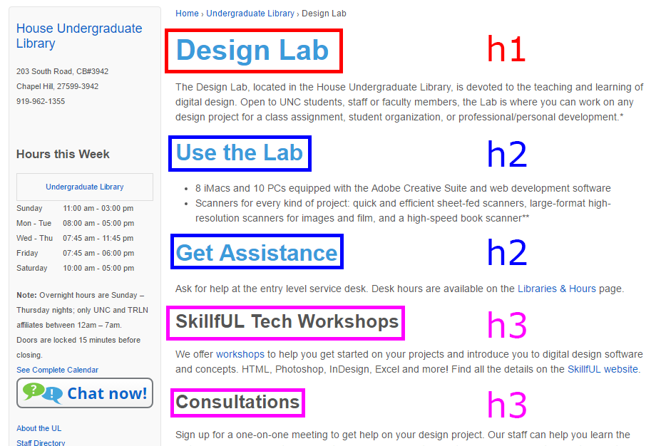
Here we have a portion of the UL Design Lab web page. The top version highlights the visible headings and their levels. The <h2> headings are under the <h1>, and the <h3> headings are under an <h2>. The left version shows what these headings look like in practice. The headings help break up the text on the page and clearly organize the information it contains.
By nesting headings and using them in proper sequence, the way the content of the page is organized becomes much clearer to viewers. When we do this across the entire UNC Library website, just viewing one page gives visitors the key to understanding how everything else is organized.
Surveying Our Headings
The UNC Library website is enormous, ever-growing, and has been touched by many hands over the years. Figuring out how to use headings most effectively in the future requires understanding how we’re using headings now.
We did this in two parts. First, we looked at the code behind the website to understand how we were adapting headings to fit the website’s unique style. Then we took a look at the website itself to see how headings were actually being used. We surveyed a wide sample of pages from the site, noting how and where headings were being used—properly and improperly.
Some of the major issues discovered during this step were:
- Inconsistency of heading use across pages
- Inconsistent handling of special page layouts, like columned layouts
- Use of headings for aesthetic, rather than organizational purposes
- Using bold or otherwise styled text in place of headings
- Skipped or non-hierarchical headings
In addition to making it harder to create a unified look and feel for the UNC Library website, these various issues also result in accessibility issues for assistive technology such as screen readers.
Next Steps
An overhaul of all headings everywhere would be quite an undertaking. In the short-term, we’ve done a few things to clean up the headings. Some of the styling has been removed (have you seen any shadows under page titles lately?) and high-traffic pages have been updated in preparation for a more sweeping change to the code.
In the long-term, the UX department plans to update the web page style guide and conduct some training to update people on the new style guide. Review and training on the new style guide are coming this summer, as part of our annual website content audit.
In Conclusion
The UNC Library website is the result of hard work on the part of many people. It’s an important source of information for students and community members—but it’s also the face of the library on the Internet. With these heading updates, we continue that work by improving the accessibility of our web resources and working towards a consistent look and feel. The results may not be obvious, but the changes behind the scenes will make a big difference to those who need them.