When the crisis hit, the changes came quickly, communicated through emails with subject lines like “[FORMAL NOTICE] UNC-Chapel Hill reduces operations, moves to remote instruction and limits people on campus”. While dormitories were being cleared out, UNC library administration sent out guidelines for working remotely, while library staff constructed makeshift home offices. As our world shifted to accommodate the safety and social distancing protocols necessary to mitigate the impact of Covid-19, our UNC Libraries User Experience team began to wonder – with the massive social changes going on, how were our library users affected? More specifically, how had the Covid-19 crisis impacted the ways that users were accessing our digital services and resources?
To answer this question, it’s important to understand that the way that all of us interact with the internet has changed since the onset of social distancing measures. An aptly titled New York Times article, “The Virus Changed the Way We Internet”, details trends in user behavior since January 21st of 2020, noting marked increases in social media and entertainment platforms like Facebook, Netflix, and YouTube. The article also notes the increase in traffic to local and non-partisan news sites, suggesting that in this crisis, citizens are looking for non-biased reliable sources of information.
To investigate the changes in UNC Library user’s digital behavior, I turned to Google Analytics. Using comparison data from the same period the previous year (January 1st-March 31st), I compared usage metrics to identify any significant changes. I had several hypotheses going into this data analysis. I expected to find an increase in mobile usage, as well as an increase in virtual services like chat. While our findings were not as stark as those reported by the New York Times, I did identify some intriguing points about our users’ behavior during this time.
Don’t Panic and Make a LibGuide

It’s a running joke in the library community that when faced with any situation, be it crisis or otherwise, a librarian’s first thought is to make a LibGuide. In the case of Covid-19, the LibGuide pointing to resources and reliable information on disease statistics and response was created on February 4th, 2020. By the end of March, the UNC Libraries Covid-19 LibGuide had been accessed over 10,000 times. This indicates that our users have been turning to the library as a source of unbiased information about this crisis.
Getting to the library
I expected to see an increase in mobile usage during this crisis. My thought was that as people needed to find information, they would pull out their smartphone and perform quick searches. What the data revealed was similar to the findings in the NYT article – there was no notable increase in mobile usage during the Covid-19 crisis in comparison to the same time period in 2019. It seems like the preferred devices of our users have not been affected by this crisis.
The way users arrive at the library website did significantly change, however. Between January 1st and March 31st, 2019, 70% of our users got to library.unc.edu by clicking on a link in search results, meaning they likely Googled UNC Library or a similar term and then accessed the website though those search results. During this time, only 17% of our users directly accessed the site, meaning they navigated directly to a specific URL without the help of a search engine. In comparison, during the Covid-19 period of January 1st-March 31st 2020, direct accesses and search accesses are remarkably similar – 45% of users used a search engine, and 44% of users directly accessed the website.
It’s a small world, after all
One of the most significant changes we saw was a shift in the geographic distribution of our users. Due to the closing of campus, our students, staff, faculty, and researchers could no longer gather in person, but what surprised me was the large increase in traffic from other countries. In pre-Covid times, 85% of our traffic came from the United States. The UK (2.4%) and Canada (1.5%) had the largest traffic percentages after that– no other countries accounted for over 1% of our traffic. In the Covid-19 era, our users’ geographic diversity has skyrocketed. While the United States still accounts for the majority of traffic (71%), we are now seeing increased numbers of users from the United Kingdom (5.1%), Vietnam (4.1%), Canada (1.7%), China (1.5%), India (1.4%) and Australia (1%).
Data Center Alley
In the process of this research, I noticed an anomaly that begged for further exploration. For the Jan 1st-March 31st, 2020 period, 2.7% of our web traffic came from a city called Ashburn, VA, and the data usage patterns were striking:
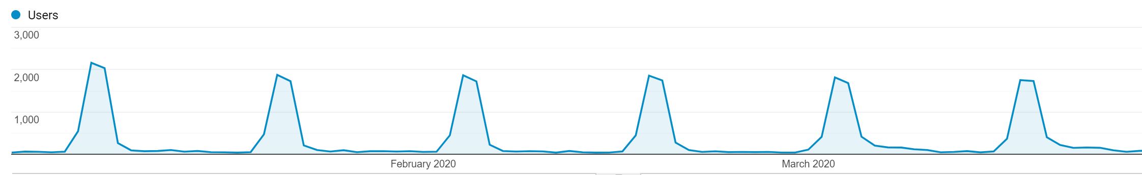
Every other week, users from Ashburn, VA would jump to around 1800 users on Wednesday, decline slightly on Thursday, then disappear almost completely until the next Wednesday traffic spike. I considered possibilities of why this might happen – was there a class or a satellite campus that was only active on Wednesdays and Thursdays? However, a quick Google search led me to an interesting trivia fact – as a rough estimate, 70% of the world’s internet traffic is routed through data centers in Ashburn, VA. It’s even referred to as the Silicon Valley of the East and my favorite, Data Center Alley, although more formally it’s called the Dulles Technology Corridor. Apparently, a unique combination of national and economic resources make Ashburn, VA an attractive place to build large data servers, and a portion of the UNC Libraries web traffic is routed through those servers.
Conclusions
Working in user experience, we try to observe and understand patterns of behavior that show us how our users typically use our services and resources. In this case, there is no typical. This data analysis was reactive rather than predictive. We are all collectively experiencing a social disruption that is quite unprecedented, and I was genuinely curious to see if the crisis had made a difference in how our users interact with University Libraries. I was heartened to see that even in the midst of crisis, the Libraries are still serving users (in fact, our chat reference statistics were eerily identical, as library staff responded to 511 chats in Jan-Mar 2019, and 512 in Jan-Mar 2020).
Rather than conclusions, what we have now is a snapshot. In data tables, line graphs, and pie charts, we have captured an image of the Universities Libraries user in a time of Covid-19. They are more spread out geographically, but still inquisitive, and they are still turning to the Libraries as a source of information that will help them understand this crisis. This user has, through their behavior patterns, given us all a set of useful recommendations for weathering the current situation:
Put down your phone.
Move around as much as possible.
Look to trusted sources for information.
When in doubt, go to the library.
Image source: https://twitter.com/melissa_library/status/1241114259318345735